DesignOps and design system leadership at CD scaleup
Table of Contents
Summary
Octopus Deploy is a continuous deployment and delivery platform targeting enterprise organisations. I joined as a Staff Product Designer responsible for its design system on the Frontend Foundations team, which also stewarded product-wide front-end infrastructure and tooling.
Outcomes
700%
increase in design system contributions38%
rise in trust in the design system34%
boost in engineer appreciation of documentation94%
of R&D awareness on where to get help with DesignOps74–83%
of R&D reporting faster delivery and design-to-development handoff
“One of the most technically capable and impactful designers I’ve worked with”
She led Octopus’ migration to a new design system platform, a hard but necessary move that measurably lifted trust in the design system. Alongside this, she established clear standards for component health, change communication, and contribution, raising the quality bar for design and reducing design debt in a way we had been missing.
Over the past year she’s been the leading force behind modernising forms across our product, a huge initiative to shoulder.

Laura Van Doore
VP Product Design @ Octopus Deploy
Turning a design system into trusted infrastructure
Something I’ve repeated over my time at Octopus is that design systems make up organisational infrastructure enabling teams to ship scalable, consistent product outcomes. Design tokens (or components) are helpful, but only when we create comprehensive design, development and governance resources can we realise the benefits across the entire organisation, rather than localised teams.
When I arrived, I found a design system relying on a cumbersome documentation platform, with unclear contribution paths, infrequent communications about changes, and reliance on a legacy, unsuitable framework at its base (hello, Material UI!). All of which translated to a lack of appreciation and low, reluctant use. That’s a roadblock, not the multiplier a design system is meant to be.
I started by re-assessing how we document design system resources, finding a frustrating authoring experience, sub-par code integrations, and painful resource management. To make contributions easily accessible, and centralise all assets under one roof, I migrated Octopus from ZeroHeight to Supernova.
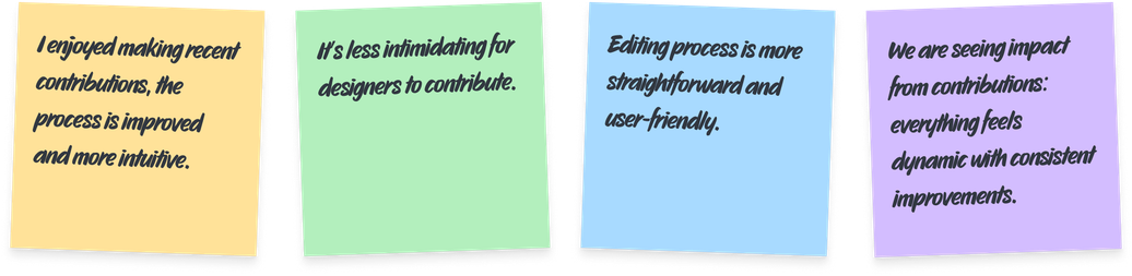
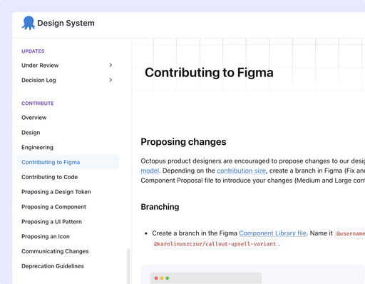
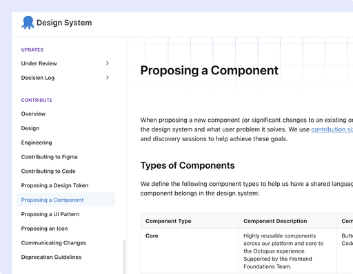
With a reliable platform underneath, I set up a framework for assessing what constitutes a contribution, how to size one, and what process to follow depending on people’s roles and type of change. Covering tokens, components, UI Patterns, icons, and documentation, contributions have risen by 700% (backed by a 62% rise in knowledge of how to contribute since the guidelines were introduced). By creating additional automations for repeatable processes, some contributions took as little as 28 minutes to get through design and engineering review, and into the system.
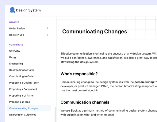
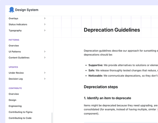
To ensure people were aware of changes (to plan their work accordingly), I set up a reliable way to communicate across the business. This directly led to all R&D teams adopting the design system, and teams working outside the primary codebase using it as a white-label solution for their needs. In Q3 2024, 15% of people hadn’t used the design system at all; three quarters later, everyone had.
“Her work will have a lasting impact on delivery teams, who ship faster as a direct result of her care and effort”
During her time at Octopus, one of the areas where Karolina had the biggest impact was our design system. She took it from something incomplete and difficult to contribute to, and built it into a mature system that has clear processes for both designers and engineers, and properly serves the people using it.

Ellen Poutanen
Senior Product Designer @ Octopus Deploy
Growing from a system into a design operating model
From an array of disconnected resources, we moved to highly trusted infrastructure. When I get asked—“how do we operationalise design excellence?”—my (very brief) answer is: by establishing rituals, growing designers, and maturing the practice they work in.
Establishing rituals
In-person time bonds teams, which mattered even more in a fully remote organisation like Octopus. The design function rarely had the opportunity to meet, let alone spend time elevating their craft (at the time there was no VP of Design to argue for it).
To fulfil the need for connection and learning, I campaigned for and secured Figma Config attendance for four designers, co-ran a knowledge-sharing Design Day, and co-led the planning for Design Week, putting my years of conference organising to good use.
Growing designers
To elevate the overall design practice, I coached several senior designers towards goals we’ve set together, such as influencing stakeholders, presentation delivery, systems thinking, or dealing with competing priorities. I coached upward too, giving Design Managers specific feedback on how to develop their reports.
Growing a team also means being intentional in hiring. Building on my previous expertise of creating a hiring strategy, I proposed a new set of screening questions for candidates that significantly sped up assessment, and shortlisted the person we hired.
“Karolina’s mentorship has left a lasting impact on me”
She helped me identify specific areas I needed to grow in order to take on more complex work — presenting with confidence, and managing competing deadlines and workload — and gave me real strategies to close those gaps, often leading by example rather than just giving advice. She actively encouraged me to protect my time and pace myself so I wouldn't burn myself out, because she cares about people as a whole, not just their output.
Ellen Poutanen
Senior Product Designer @ Octopus Deploy
Maturing the practice
It’s challenging to uphold quality by repetitively asking people to care about standards. Quality becomes scalable because processes supporting it feel natural to follow. Extending the design system work, I introduced component health checks, decision logs, and automatic linting that enforced our quality bar without heavy-handed interventions. What started as system-specific, became adopted by the entire design discipline.
To ensure we were getting the intended outcomes, I kicked off a Design System Survey initiative, running every two quarters. I used it as a research instrument to track new, persisting, and resolved themes, informing my design planning for the team. Participation grew every round, up 35% across the series. I identified three critical, most requested themes (contribution process, information discoverability, and an interactive component showcase), all resolved by next quarter.
“Her leadership, focus and generosity made her a steady, trusted presence on our team”
Karolina is one of those rare colleagues who leaves a lasting impact on everyone around her. She played a direct role in building processes around our design system that made our work better. Beyond her skills, Karolina brings a contagious enthusiasm that's genuinely rare - the kind that lifts a team's energy just by being in the room.

Mark Siedle
Senior Engineering Manager @ Octopus Deploy
Reshaping ⅓ of the product surface
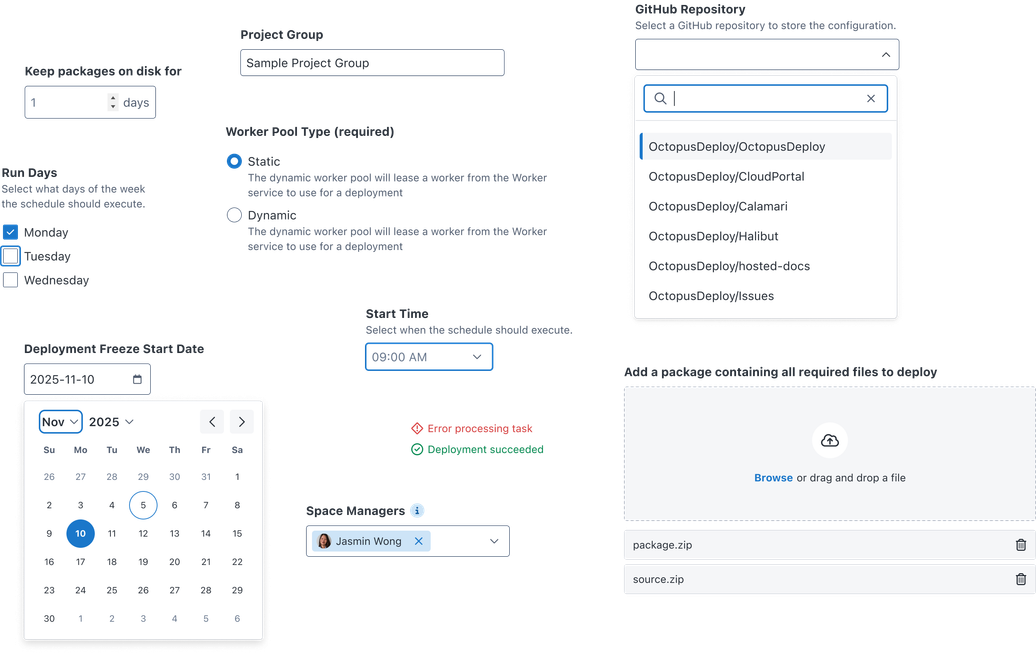
Octopus relied heavily on manual configuration. Customers spent their days setting up deployments, environments, spaces, variables and permissions—nearly all of which happened through a form interface. When a third of the product (and its most critical user journeys) runs on the same pattern, it isn’t “just components”—it’s the primary way people use the product.
Sequencing to avoid experience drift
Forms were fragmented and outdated, and had accumulated years of teams solving the same problems slightly differently. They also inherited glaring UX issues from an early version of the Material UI framework, which made them inaccessible. Teams who wanted to make improvements were limited to old patterns that didn’t fit modern designs.
To address this, instead of framing the solution as a set of component builds in the design system, I proposed a multi-year customer experience initiative. This framing gained executive sponsorship, a green light from design leadership, and capacity from teams outside my reporting line.
I split the initiative into three deliberately sequenced streams: from interface patterns and content guidance, through component builds, to a safe, phased migration. I brought Support, Customer Success and account management leaders into scoping, ensuring that customer concerns shaped what we built and how.
Choosing friction over jarring UX
Partway through the component build phase, the appetite for affecting customer trust, caused by two visual and interaction models existing side-by-side, significantly lowered. Responding to worried stakeholders, I decided to pause and adjust the rollout plan to avoid potential customer-facing costs.
It was a difficult decision to make, knowing the cost of working across two design systems will create significant friction and confusion for teams. Inevitably, my surveys showed respondents “both excited for it and blocked by form elements absence today”. While navigating the change was complex, internal frustrations were more recoverable than fractured customer experience.
Handing over a multi-year project
The initiative survived a company-wide pivot which challenged the capacity the migration has been planned against. Within two weeks, I re-pitched a delivery model to keep momentum with fewer people, and not lose the initiative entirely from the roadmap.
When the build kicked off, the results were precisely how you’d expect from reliable infrastructure:
“The migrations had the appropriate patterns for usage available. It made the work very predictable and mechanical, as opposed to something requiring novel solutions for everything.”
By the time I left, the work was progressing steadily without my involvement, relying on previous planning, resources, and a shared understanding of UX goals.
“She made our work feel like a true design and engineering partnership rather than just a handover”
She is a thoughtful and empathetic leader, incredibly organised, and clear in how she communicates. She brings clarity without being prescriptive and makes people feel trusted and heard, which made even complex projects feel easy to work through.
My team of engineers regularly commented on how well she understood the technical side of the work — enough to have meaningful conversations about implementation, constraints, and trade-offs.

Mandy Michael
Lead Software Engineer @ Octopus Deploy
Preparing for AI-augmented work
In 2025, I noticed people using LLMs to generate front-end code, often without basing it on design system resources. What started with a few people experimenting ballooned into substantial work—ignoring best practices and design direction—being shipped to production. Our existing quality assurance processes could not scale to match the output, a problem many companies were facing.
By Q2 2026, the Design System Survey showed AI-readiness as a brand new top theme, with 49% of people already using LLMs to interface with the design system. Duplicate skills proliferated, agents dropped context or multiplied legacy solutions over new, preferred ones. The gains were arriving at the high cost of product consistency.
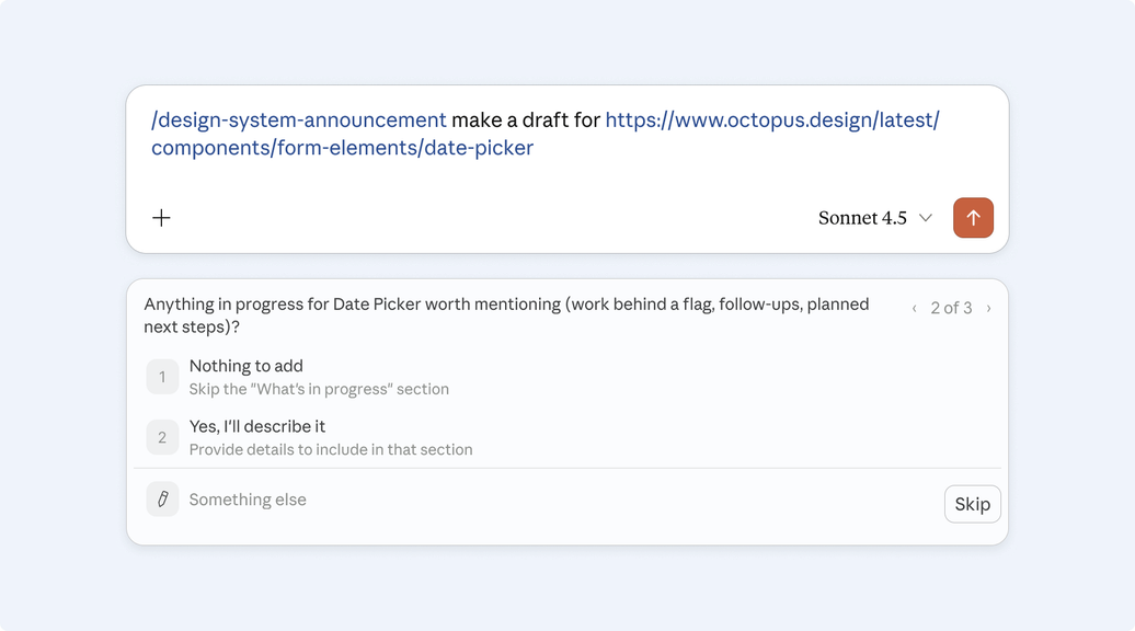
I had been working with our engineering lead on machine readability—consistent naming conventions, semantic markup, and investment in Figma Code Connect—but that progress was getting undone faster than we could remedy. To limit the blast radius, I built harnesses and skills that encapsulated current guidance, automated contribution steps and drove legacy migrations. I published tools to communicate design system changes, and helping author content for forms (to aid the migration). The shift in how people worked was already visible:
“A designer on my team was able to vibe-code a prototype of an Accordion, which saved many back-and-forth questions about the desired behaviour. Absolute game changer, possibly the most efficient design handover of my career.”
Because we’ve always prioritised documentation and standardisation, design system was already closer to machine-readable than most. What we needed was meeting people in the tools they started were using.