Founding and leading design at a web performance platform
Table of Contents
Summary #
Calibre is a bootstrapped, profitable SaaS business offering web performance monitoring, which I co-founded with Ben Schwarz↗. As a founder and Principal Designer, I led design strategy, end-to-end product releases, and created processes that helped us scale the business.
Creating UI systems #
With no designer on staff during the first few years, both marketing and the product were built without the tools to guarantee a cohesive design language. I created two Design Systems (product and marketing) with associated usage documentation to enable our small team to release with confidence. Outside of Figma, I also contributed to live components implemented in Storybook.
Thanks to both robust UI Kits, we were able to rapidly release new features and refresh existing pages for consistency in the visual language. Because all Calibre employees are design-savvy, it also empowered them to make positive changes without following a more lengthy, end-to-end design process.
Directing design #
I was responsible for creating a visual strategy for all design aspects of Calibre, including both product and marketing. Easy to use, resilient design can often influence buying decisions, so I always treated it as business critical. Even more so than performance, developer-oriented tools are frequently lacking in this area.
Cohesive and modern UI #
Calibre was initially built by a founder with strong design and product sensibilities. When I joined, I committed to auditing the existing UI and enhancing it with the help of newly established design systems and interface guidelines. Because inclusion is one of my core values, I spent time on information architecture, appearance, and interactions to make sure the UI was easy to understand and navigate, no matter someone’s capabilities.
Clear marketing showcasing the product #
Marketing design is an art. In the latest iteration of Calibre’s marketing site, I prioritised clear copywriting with high-quality product imagery. While it’s tempting to turn marketing pages into feature listicles, instead, I focused on telling a story of how to successfully use the end-to-end platform. This approach has markedly increased our trial conversions.
Establishing processes #
I love writing and how it empowers even non-remote teams, so it’s not a surprise I’ve spent a significant chunk of my time creating repeatable processes, templates, and guidelines. Creating processes isn’t only reserved for bigger organisations.
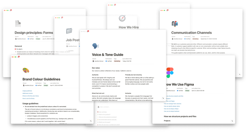
Without locking ourselves into rigid rules, I authored documentation for design principles, approaching customer support (which yielded a consistent 97-100% satisfaction rating), how we use communication channels, an entire hiring strategy, and more. Now, all the Calibre know-how is easily accessible, either for teammates or future you.
Releasing product features #
The foundations work described above empowered us to release several features that simplified understanding and improving performance for teams small and large. Here are a few selected projects.
Providing real user data without tracking #
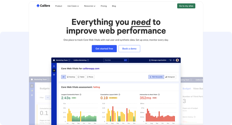
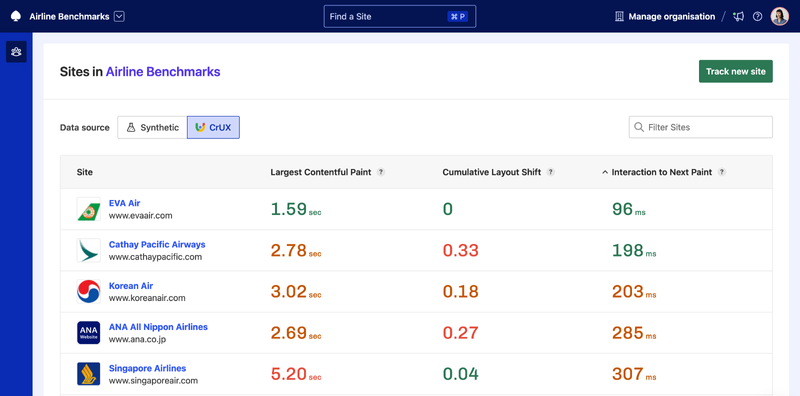
With all eyes on Core Web Vitals (a set of core performance metrics for UX, also used as a signal for Google Search algorithm) we unlocked a way of tracking them across synthetic and real user datasets. Often, a roadblock to real user monitoring is the extra cost and need for external scripts. With Core Web Vitals Dashboard, teams can quickly do a health check with neither of those obstacles.
This is an excellent update! Love the instant switch between p75 and the overall histogram. Thanks for your recent focus on bringing RUM into the dashboards, it’s been very helpful.
Feature release post
Track real user Core Web Vitals data with CrUX DashboardSimplifying making sense of performance #
Web performance is famously complex, data-rich and known for gatekeeping anyone but developers. One of our guiding principles is making performance accessible and understandable to anyone who expresses interest in the field. Again, the more collaborative and informed your team is, the more success you’re going to have.
This is great, Karolina! I love seeing the LCP time in the render timeline.
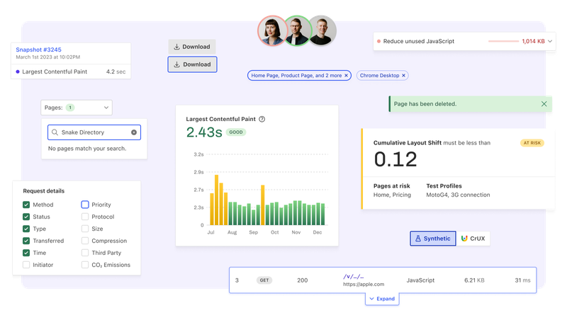
Snapshot reports guide readers to quickly spot the most critical performance issues. While they are data-heavy, they use an intentional visual language and content strategy to prioritise the most impactful tasks to focus on.
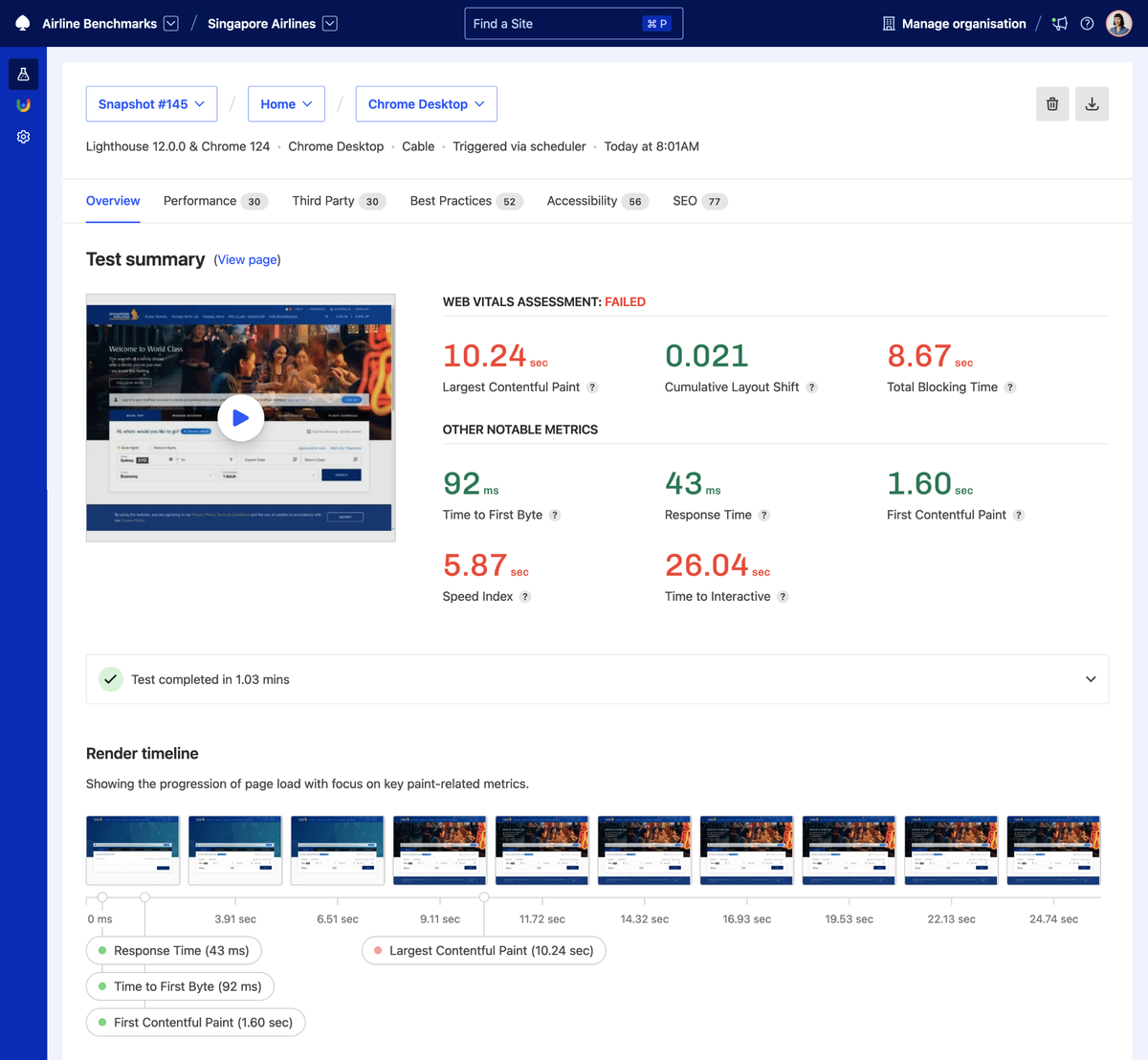
Feature release post
Easily investigate page performance with Snapshot OverviewFostering collaboration #
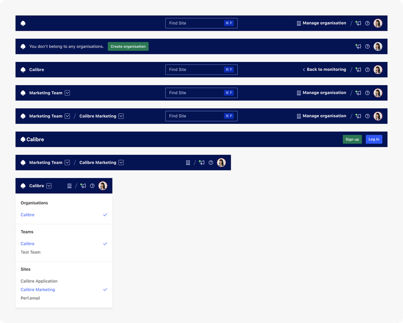
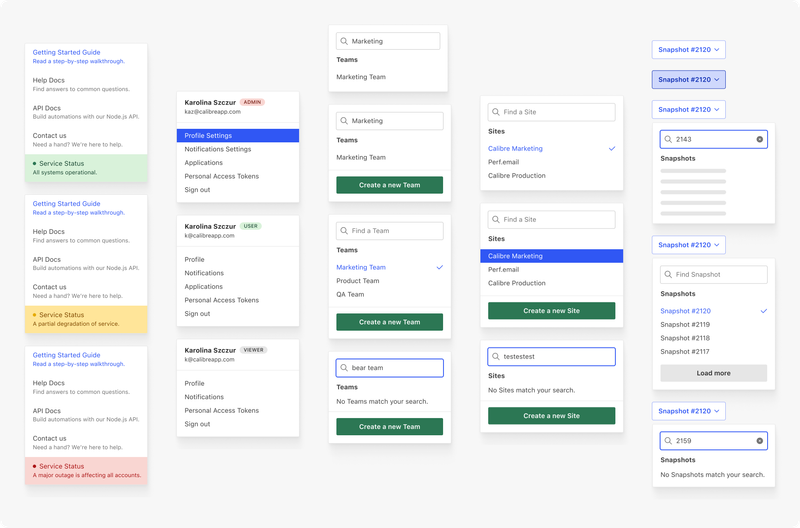
Most impactful work happens when cross-functional teams focus on the same goals. This rings even more true for web performance, where stakeholder buy-in can be difficult to get. While project, people, and level of access organisation might sound mundane, it allowed Calibre’s customers to effectively divide areas of responsibility. It made performance a shared initiative, reduced the cognitive load of too much data, and collaborated with external contractors or agencies.
Feature release post
Collaborate on Speed with TeamsHelping prevent UX regressions #
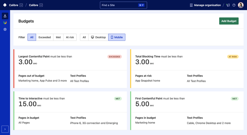
One of the biggest challenges of web performance is not only achieving good metrics, but keeping them that way. Budgets not only allow teams to track key metrics against their goals, over time, but take a proactive approach with at risk notifications. Effective speed work is all about trends, so the earlier teams can take action, the lesser the negative impact on their UX and customers.